
Composition
Every photograph is a set of decisions about what to include, what to leave out, and where to place things within the frame. Composition guides are tried and tested patterns for making those decisions. They aren’t rules to obey. They are patterns that painters, designers and photographers have found, over centuries, to work reliably with the way people look at pictures. Knowing them gives the photographer a vocabulary for framing a scene with purpose rather than by chance.
At their heart, composition guides are about directing the viewer’s eye. When someone looks at a photograph, their eye doesn’t take in the whole frame at once. It moves from point to point, settling on whatever attracts it most and then looking for where to go next. A strong composition plans that journey. Lines, shapes and the placement of elements tell the eye where to start, which route to take and where to come to rest. Leading lines carry the eye towards the subject. A spiral draws it inwards, and a frame within the frame holds it in place. Placing the subject on a thirds intersection or a phi point gives it emphasis without the static feel of a dead-centre position. Each guide is a different way of saying “look here”.
That direction is what lets a photograph tell its story. If the eye arrives at the subject quickly and confidently, the viewer understands at once what the picture is about, and what the photographer wants them to notice and feel. If nothing guides the eye, it wanders aimlessly round the frame, picking up a bright patch here and a stray line there, never quite sure what the photograph is meant to say. The viewer usually moves on, often without knowing why the image didn’t hold them. Good composition stops that wandering. It gives the image a clear centre of attention and a clear route to it, and it keeps the eye within the frame long enough for the story to land.
Composition is not only about lines and placement. Tone and colour play just as large a part, because some areas of an image pull the eye far more strongly than others. The eye goes first to the brightest part of a picture, so highlights and white areas act like magnets. Used well, a pale subject against a darker setting or a pool of light falling on the key element becomes a natural focal point. Used carelessly, a blown-out sky, a bright patch near the edge or a white object in the background will drag attention away from the subject, and can even lead the eye straight out of the frame. This is why so many photographers darken the edges and corners of an image: it keeps the eye drawn inwards.
Red works in a similar way. It is the most attention-grabbing colour in the spectrum, and even a small touch of red will stand out in an otherwise muted scene. A red coat, door or flower can become the focal point all on its own, which makes it a powerful tool when it sits on the subject. When it doesn’t, it competes with the subject, and a stray red object at the edge of the frame can be just as distracting as a bright highlight. Part of composing well is spotting these hotspots, whether white or red, and making sure they are working for the picture rather than against it.
The guides that follow each show one way of arranging a picture. They work best as tools rather than formulas, and the strongest images often combine several at once. They are also there to be broken, but breaking them works best when it is done on purpose, by someone who knows what effect the break will have.
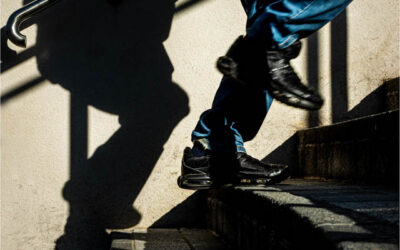
Diagonals
Diagonals bring energy, movement and tension into a photograph. Horizontals feel at rest and...

Vertical Lines
A vertical line composition uses a strong upright line to structure the frame and carry the eye up...

Radiating Lines
A radiating composition is built on lines that spread outwards from a single point, like the...
